31 July 2006

Screaming Piha

At long last, I am posting the sketch of the 'final' layout for 'The Scream', my Screaming Piha painting that won't seem to jump up into action on the drawing table. I am still working on the feet, and will be doing a fair bit of experimenting on the background in the next few days, but here is the composition of the image. The feet of this bird have been a challenge for me to work out. I am not a big fan of skimping on the feet. Their positioning and overall structure says a lot about a bird painting, even though most observers barely even notice if they look correct. I will post again specifically about depiction of bird feet, and update the final Screaming Piha foot position soon.
Image posting delayed...I will try to get blogger to accept the image again later today.

26 July 2006

Painting of the Day - Barry VanDusen


'Kingfisher at Sterling Peat'. A great field sketch painting by Barry VanDusen. A big subscriber to the school of thought that the best images are gathered from life, painted in the field, VanDusen painted this at a wetland area in his native Massachusetts.

25 July 2006

Technique exploration - from 'The Undercliff' by Elaine Franks


For those of you out there that are old hat with watercolor, the technique I'm going to talk about is bound to be old news. Others might have seen the results, but never quite knew how it was obtained.
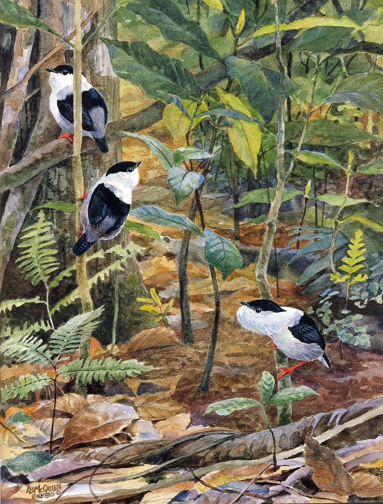
When I was younger, I found a great book called 'The Undercliff' by Elaine Franks. The book is a naturalist's sketchbook which explores a place in England along the south shores of Devon to Dorset. In this book, Elaine Franks shares her impressions, from tiny sketches of insects and flowers to full page illustrations of a particular resident to these woods. When I first saw these images I was very new to painting in watercolor. Most of my work in those days was simple, unchallenging washes and dry brush work. The impression these paintings had on me was distinct. I looked at the depth of color and vibrancy, the intriguing textures and was stupified. I really had no idea how to even attempt painting in this manner. I was saved by my teacher at the time, Mrs. Salinger. I brought 'The Undercliff' into art class and asked her to leaf through it with me. I showed her the paintings I had marked to see if she could shed any light on the technique. The pieces are mixed media, often watercolor over ink drawing, but the pure watercolor technique itself was pretty readily decipherable to my teachers more trained eye.
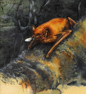
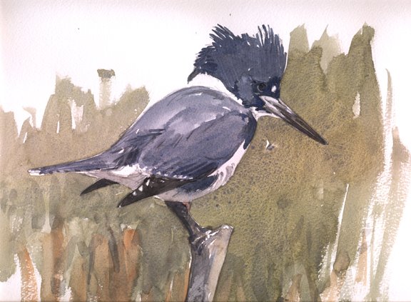
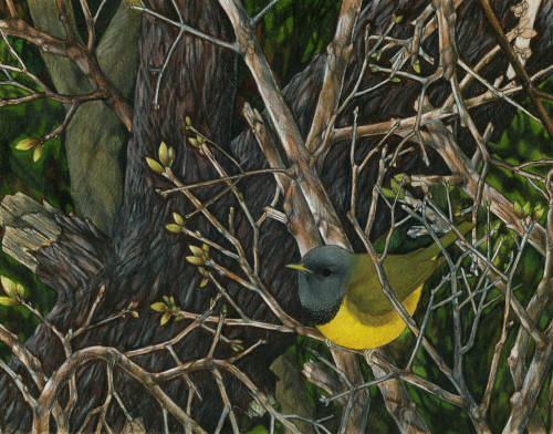
The first piece we worked out involved wet on wet work. This technique was in my repertoire then, but not quite to the extent that it was used in this work. In the bat painting, much of the loose, flowing, smooth gradation in colors, especially well seen in the soft grading of colors along the log is wet on wet. In the Moth painting, wet on wet is also used. In this piece, the pigments are laid on less uniformly and the vein like pattern of water and pigment traveling along, through capillary action is left in the final image. Dependent on what type of paper you are using, and the degree to which you are interested in controlling this capillary action in your painting, you can either use this as an effect or smooth it while the surface is still wet, dependent on whether or not the veining is desirable to you.
Moving on, the wet on wet area on the log in the Bat painting is punctuated by some interesting crackle patterns... there are similar patterns in distinct patches in the Moth piece. This pattern, a very attractive organic looking effect is obtained by laying in a wash and selectively sprinkling a cluster of salt grains on the wet paper. The grains are left until the paper is completely dry, leaving behind these beautiful patterns. Using different kinds of salts can give you different effects. The best, most dramatic effect comes from the large flakes of kosher salt (This remains of my favorite techniques - used very selectively though).
Lastly, a similar effect can be seen in the Moth, most noticeably in the area directly above the large moth in the foreground. This is a blotting effect, most likely using a crumpled-up paper towel. Calculated removal of pigment and water from your paper can create these beautiful patterns, breaking up your pools of pigment, exposing colors from the washes below.
In the end, what appeared to me as a mystery when I first saw these images in the pages of 'The Undercliff', turned out to be relatively simple in practice. It was a great eye-opening experience for me to see the flexibilities within the watercolor medium, even when painting boldly like Elaine Franks' work.

17 July 2006

Featured Artist - Jennifer Brumfield

Copyright Jennifer Brumfield 2006

I came upon the scientific illustration website of Jennifer Brumfield through a friend and was really impressed by her interesting and unique style.
Her website Meadowhawk Art.com has several examples of her work including some great birds like this Mourning Warbler, as well as some stunning Dragonfly work she has completed for a guide called 'Dragonflies and Damselflies of Cleveland Metroparks'. I contacted Jennifer recently to ask her a bit about her work and drawing techniques. She had the following comments in reference to her Mourning Warbler piece and drawing in general. "This MOWA is based off of a 'snapshot memory' that I experienced on the boardwalk of Crane Creek State Park/Magee Marsh Wildlife Area, in NW Ohio (the 'other Point Pelee') on a mid-May morning, height of spring migration 'round here of course. I remember the lighting being perfect..it was particularly overcast and dull and droll..but the cool blue-gray tones of the bird's head were amplified by its lightning yellow underparts. Adult male Mourning is perhaps one of NA's most splendid birds, in my opinion. Typically playing tough-to-get by clamboring around myriad branches of fallen trees....it always spawns absolute gasps when it's seen by newbies and avids alike."

"The illustration was created in colored pencil. Most, if not all of my illustrations are colored pencil, or 'regular' pencil, or pen and ink. I just can't get interested in paints, right now. There's something about sharpening a pencil and just having at it.....paints need to be mixed, brushes need to be washed....I suppose that's a 'simple' part of me (or perhaps lazy?) coming out through my work. Also, I'm smitten with the thick, paint-like quality that I find in watercolor colored pencils....I needn't add water, at all, and I'm completely happy with them. Buy a huge pack for under a hundred, and you're ready to rock."

Check out her website and keep your eyes out for her work in Birding Magazine and elsewhere in the future.

Copyright Jennifer Brumfield 2006

Copyright

I've been doing some reading about Copyright law in the last few days. I've found a few good sites describing the situations surrounding artist copyright and distribution, but nothing that really satisfies my needs exactly. The following QA, and a few other tidbits from This Website are instructive.

Q: Are there any times that I can use a copyrighted work without risking infringement?

A. Yes. The concept of fair use permits the utilization of copyrighted materials for certain purposes. For example, a newspaper can publish copyrighted works for purposes of reporting news and a teacher can make multiple copies of certain works for classroom use without risking infringement. In order to determine if a use is fair or is an infringement, one must determine how much of the copyrighted work is used and the impact this use will have on the potential market for the copyrighted work. If large portions of a copyrighted work are used or if the use lessons the potential market for the work, there will be infringement.

I think, in this Blog, the use of artists works, with permission where possible is fair. I don't think the value of copyrighted works is compromised. Please contact me if your works are used but you would prefer them removed.

11 July 2006

'Painting Birds' by Susan Rayfield


A few years ago I sent one of my tiny paintings to John O'Neill, a great painter and ornithologist from Louisiana State University. I got some great critique notes back from him including a bunch of tips on technique, equipment and new resources to check out. One of his best pieces of advice was to check out a book called Painting Birds by Susan Rayfield. The book was now out of print he warned, but getting a copy through the used book market was not too hard. It wasn't until a while later when I worked for the Massachusetts Audubon Society on Martha's Vineyard that I came upon a copy. I highly recommend this book for anyone interested in painting birds. There is something for every painter in there, irrespective of your style, subject matter or preferred medium. The work of several great painters like John O'Neill, Larry McQueen, Raymond Harris Ching and many others are chronicled. The book is arranged as a series of lessons from the studio, describing a set of techniques important in the repertoire of each artist. There is a section on 'Jungle Birds' with this fabulous piece by McQueen. Check this book out on Amazon or ABE books, I am sure there is something new for most painters to learn in there.
Below is the cover of one of Susan Rayfield's other books, (I couldn't find a single image of the cover of Painting Birds on the web). This book is good as well, definitely worth checking out, especially for the parts chronicling the work of Don Eckelberry and Lars Jonsson.

10 July 2006

The all important Background


Watercolor is a particularly well suited medium for the loose interpretive handling of soft, subtle patches of light and color and intimations of habitat detail. The transparency of color and natural look of watermarks translate beautifully for depictions of these slightly out of focus background fields in natural history paintings.
Here is one of my favorite paintings which I have turned to frequently for instruction on the subtleties of loosely painting background in watercolor. In this case, the neotropical rainforest middlestory. This piece by Larry McQueen is the cover painting for the CLO-Macaulay Library, Songs of the Antbirds CD set. I was lucky enough to see the original painting when it was here at Cornell for scanning a while before the CD set was produced.
I assume that the background of Larry's painting began with a wet on wet wash of yellows, accentuating the well lit area on the right followed with additions of other colors like the greens and blues of the foliated area on the left. A loose bluish streak that shows through on the right side breaks up the open lit yellow space. The areas covered with foliage and the birds were added in on top. The birds may or may not have been masked beforehand. Since the birds have white areas, I would imagine that at least these areas were masked beforehand. Masking gives you the opportunity to start from scratch, layering from clear paper to build up the textures of a birds plumage.

This is an initial concept wash for loosely trying out a few elements I am thinking about for the Screaming Piha piece I have finally begun work on. This has helped me with composition questions, working out a color scheme and allowed for a bit of practice in techniques I will employ when I go to work on the final painting. This Piha is a species found in lowland tropical forest, often in even aged, gallery-like forest. The habitat tends to be on the darker side, but is sometimes punctuated by forest edge or tree-fall gaps. My reference photos are all from forest a bit darker and grayish green, but I am trying to infuse a bit more of a warmly lit look. Even though I am interested in keeping some of the watermark edges in the areas of yellow and bluish sky and green foliage elements, I think a smoothing wash over the top of these elements may be in order. The watermarks in this sketch make some of the background elements too blocky and distracting. They should be a bit more out of focus.

09 July 2006

Painting for the weekend


I am working on a painting of the lowland neotropical rainforest right now, (update to follow soon). Looking through scans of paintings others have done from similar habitats is often a good way for me to wrap my head around a tactic for working on a background from a particular habitat. This Fuertes piece has such a great, loose representation of the forest behind. The story of the Motmot is conveyed even better than if it were just the great bird. I love the termite mound, the loose palm leaves and the overall handling of understory and forest edge light.
Problems with upload of the image. One more try and then I'll have to pick another. Blogger seems to dislike certain images and no matter how they are converted, it doesn't work.

05 July 2006

The Auk - Final


Copyright Benjamin Clock 2006
I worked back into the original painting this weekend to square away some final details before sending it off to the editors. Here is the final image. Mostly, I worked back in to the background vegetation, softening and adding some sap green and titanium yellow highlights, as well as some additional color in the throat shield irridesence. I think the image has a bit more depth now and I think it pops quite a bit more. This view is a little washed out looking, the original and the printed version on the Auk covers has a much more saturated look.
Check out the 'Auk page'

01 July 2006

The AUK!

I am really excited to write about the great news I just recently received about the publication of my Carola's Parotia painting on the cover of the Auk! The October 2006 edition will look something like this image. This is a mock up I made (when I first submitted the painting, and really, really hoped that it would get the cover). I can't wait to see it in print.
I have removed the old version, look above for the final mock up.